
To use this sharing feature on social networks you must accept cookies from the 'Marketing' category
Dyslexia and eLearning fonts
Do fonts for dyslexia really work?
We have already talked about " How to create an accessible online course?" and " Disability and special needs: the advantages of eLearning", i.e. how important it is to present the information in the online course in a clear and readable manner.
In this article, we take a closer look at the case of special characters for learners suffering from dyslexia, a specific learning disorder that leads to difficulties in reading and sometimes writing. Dyslexia is increasingly common: from 2010 to 2019, young people diagnosed with dyslexia increased fivefold ( Ansa).
There is increasing talk of 'dyslexia fonts', but experts warn to be wary of enthusiasm in this direction as they are based on a misconception.
In 1927, neuropsychiatrist Samuel Orton coined the term strephosymbolia (literally meaning 'twisted symbol') when he observed how many of his young patients with reading difficulties reversed similar letters (e.g. d and b). The term took on a different meaning over time, but the name remained unchanged, fuelling speculation that dyslexia was a visual disorder that caused printed letters to appear in a confused and disordered manner.
Since then, there has been no shortage of proposals for dyslexia-focused products (coloured glasses, prism glasses). In the last decade, there has been frequent talk of typefaces specifically designed to alleviate the reading difficulties associated with dyslexia. Due to the size and shape of the fonts, thicker lines, the speed and accuracy of dyslexic readers should be facilitated and students should be helped to distinguish between similar letters. Indeed, type designers claim that the 'heaviness' of the letters, for example, prevents them from flipping over or going from left to right, while the arms - the top of a b or a d, for example - vary in thickness to reduce possible confusion.
However, the fact that dyslexia is a visual problem rooted in inaccurate letter recognition (an assumption on which these fonts are also based) "is a myth," as Joanne Pierson, a speech pathologist at the University of Michigan, explains. "Contrary to popular belief, the main problem with dyslexia is not letter reversal (although it can be an indicator)," she writes. The difficulty lies in identifying the discrete sound units that make up words and in 'matching individual sounds to letters and letter combinations for reading and writing'.
In short, dyslexia is a language-based processing difficulty, not a visual problem; despite the widespread and enduring misconceptions that, according to the International Dyslexia Association, really die hard even when they are vigorously disproved or discredited.
Evidence in favour of dyslexia fonts collapses
In a 2017 study, researchers tested whether OpenDyslexic (an open-source, free font characterised by thicker lines near the bottom of letters) could improve the reading speed and accuracy of children with dyslexia.
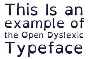
Example of OpenDyslexic font (attached)
The researchers compared the font with two other popular fonts, Arial and Times New Roman, and found that the seemingly dyslexia-friendly font actually reduced reading speed and accuracy; not to mention that none of the students reported a preference for the OpenDyslexic material.
Another 2018 study compared another paid dyslexia-friendly font, Dislexie, with Arial and Times New Roman and found no benefit in terms of reading accuracy and speed. Again, the children expressed a preference for traditional fonts.
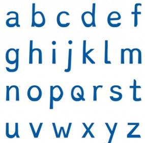
Example of a Dislexie font (attached)
Dyslexia fonts: false hopes?
The 2017 study points out that dyslexia fonts can instead create false hopes in students and cause disappointment. "The greatest harm can occur when students, who have already experienced significant academic difficulties and failures related to learning to read, experience further failure when they are unable to read significantly better with a font designed specifically for them."
Children with dyslexia often face stigma in comparison with their peers and may fear that they are not 'smart' enough to master the materials. If a child is promised that a dyslexia font can help them read and then their grades or reading experience do not improve, they may conclude that the problem lies in their abilities and not in the font, contributing to feelings of helplessness and discouragement.
Readable fonts
According to experts from the British Dyslexia Association, readable fonts are certainly important ... for all readers, not only for dyslexics: the association recommends using fonts designed for general readability (e.g. Arial, Verdana and Tahoma).
How can reading really be improved?
- the font size should be between 12 and 14 points,
- section titles should be used to create a coherent structure within documents, facilitating navigation and comprehension.
Translated with www.DeepL.com/Translator
Did you like this article? Sign up for the newsletter and receive weekly news!
Subscribe to NewsletterComments:
No comments are in yet. You be the first to comment on this article!