
To use this sharing feature on social networks you must accept cookies from the 'Marketing' category
The 5 motion graphics infographics that make a difference in eLearning
Why and when is it appropriate to make an animated infographic? Here are 5 tips for this type of asset in your e-learning productions.
Content production for e-learning is an activity subject to rapid change in trends and taste. It is not only the interaction, the usability of the course or the choice of content that is given space. Very often it is necessary to find the right tools to tell the best story of the content that is provided to us by our clients or that we ourselves have written for our course after researching the sources.
For this reason, one of the evergreen assets of content production for e-learning is, to my start, infographics. A production with great potential that offers better possibilities if it is animated.
Why and when is it appropriate to make an animated infographic? Here are 5 tips for this type of asset in your e-learning productions.
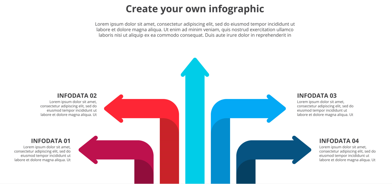
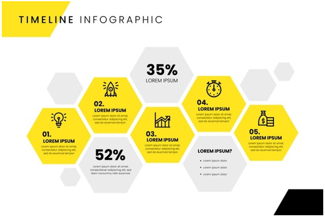
1. Say goodbye to the terrible bullet points
In general, when we are transforming a training project into an e-learning content, we must necessarily deal with bullet points, those terrible bullet points that threaten the attention of the course users.
For course writers, using lots of bullet points can be practical for two reasons: summarizing content and organizing it.
Unfortunately, however, in the design phase of the e-learning solution we must necessarily find a way to transform a series of lists through effective graphic solutions.
A list can thus become a sequential infographic, with arrows and text alternating with the voice over and allowing the learner not to be faced with walls of text that lack appeal.
Another solution is to choose infographics that allow you to "break" the topic into different parts, through moving infographics that allow you to organize content into blocks, to make it more usable for course users.
There are several creative solutions and hundreds of ready-made templates, both in vector format and in After Effects format.
The latter allows you to speed up the animation activity, you only have to fill in the fields and synchronize the content of the infographic with the voice over.
Much better than throwing a cold bullet point at the screen, right?
When my clients present me with long lists or topics that feature often boring or incomprehensible bullet points, I always try to put myself on the user's side and ask myself "how can I follow this course without getting bored?".
That's why I choose infographics that are firstly organized, then graphically consistent with the rest of the course and, mainly, that break the topic down into points that help memory. But more on that later.
2. Illustrate change over time
An infographic not only allows you to channel attention to a given topic, but it can tell a story over time.
How much did that company's revenue increase from 2016 to 2022?
What were the cruise ship movements in the Mediterranean in 2021?
How much has the population of Benevento changed from 2000 to the present?
How many of the company's workers have not been injured as a result of the introduction of advanced machinery?
All of this data can be reported within a range of information and the change can be told through a dynamic infographic, that is, through a table that changes on the screen.
The change can be told through a voice over or simply with the data on the screen and music accompanying the animation.
Remember to always be simple and essential in your data presentation. Users appreciate clean infographics with data and topics that are covered with simplicity.
Animated infographics allow us to turn a somewhat boring piece of data into an enjoyable resource to study - that's kind of the goal of an instructional designer's work, isn't it?
3. Using infographics for brand identity
"Data is beautiful" is a term used to highlight the inherent beauty of data, but more importantly, the ability to create eye-catching infographics.
So, whether you're a marketing manager or an e-learning content developer, you can use infographics to increase your brand awareness or that of your customer.
One of the simplest and most effective methods (in the series less is more) is to create continuity with the corporate colors in the development of an infographic. In fact, many companies have graphic guidelines as a model to follow for all the content that is created, from social posts to slides for presentations passing right through ... for e-learning content.
That's why it's essential to use within your infographics:
- The fonts used by the client or your company
- The colors proposed within the guidelines of your company or your client
- The logo in plain sight
- A graphic style that creates continuity with the content usually proposed by the company or the client
Don't forget to create continuity with the rest of the course you want to develop: for a course to be enjoyable for users, you'll have to create infographics that are visually consistent with the content that won't tell data or bullet points.
In addition, the content will be easier to share and appreciated by users on social networks that have a very low attention span!
4. Reuse infographics for social media and as a "download" in the resource section of the course
Infographics, whether animated or static, can be a very valuable tool to fix certain topics and communicate them outside the course.
Very often my clients ask me to extract some screenshots that contain infographics, diagrams, visual summaries in order to reuse them as resources for the course to be printed (yes, it's not the most sustainable, but it's often requested) or downloaded.
However, infographics made for courses can also be used to communicate some data outside of the courses, they can be used as a teaser of the course to entice people to buy it or, even more surprising case, they are uploaded to industry forums and social where lots of data fans post every day some of the most beautiful infographics you'll ever see.
A famous example is the r/dataisbeautiful channel on the social Reddit, a veritable cauldron of infographics that gathers thousands of subscribers excited by being able to see the behavior of data on graphics. And the topics, needless to say, are the most disparate: they range from pandemic data to the growth of the U.S. population, passing through data on cryptocurrencies and those on the change in the temperature of planet Earth.
Try it to believe.
5. Use infographics to give you accurate information to ask for in final tests
Infographics prove to be an excellent tool to channel the attention towards some topics that are a bit difficult but important and that, without a graphic or dynamic help, would risk to go unnoticed.
This is the case of some important dates, topics on safety at work, lists of documents that should or should not be re-shared by employees in order not to create a leak of sensitive or protected data and so on.
Often my clients ask me to create courses that tell the rules and best practices for safety within a company. It's a list of rules and regulations, rules to keep and all sorts of prohibitions...so how do you keep the focus and allow them to remember some important topics?
An infographic not only improves the graphical presentation of a topic, but also channels attention towards a piece of data that can be repeated in the final test of the course.
Mind you, you can either repurpose the infographic in the test to provide the learner with a quick review of the data before answering the question or, more simply, you can ask specific questions about the topics that were provided within the course thanks to the infographics.
It will be easier for learners to remember certain topics, especially if they are presented as bullet points (see point 1 of this article), so that they can consistently answer the questions that will be presented on the final test.
In short, the use of infographics is not limited to a mere "embellishment" of data, but they can have a particular importance especially in the design strategy of your course, they can be repurposed on social networks to advertise and increase user engagement.
The potential of a course that uses infographics is definitely greater than courses that do not have them. This is essentially because infographics allow you to simplify learning and alternate course content so that you don't have to passively listen to a mandatory lecture on topics that can be monotonous.
There are many tools to create infographics without having skills in motion graphics development: my advice is to give space to dynamism (use of animated graphics that go in sync with the voice) or interactivity (use of clickable infographics, whether they are created in scorm format or with tools on the web).
Sometimes all it takes is a Google search to find tools that allow you to fill in fields and make great infographics quickly and with really nice results.
Don't limit yourself to pie charts or classic histograms, but go in search of the most original templates, maps, the latest trends you can see in the newspapers and enhance the taste in favor of cold data.
Translated with www.DeepL.com/Translator
Did you like this article? Sign up for the newsletter and receive weekly news!
Subscribe to NewsletterComments:
No comments are in yet. You be the first to comment on this article!